- Non-standard grid of a page
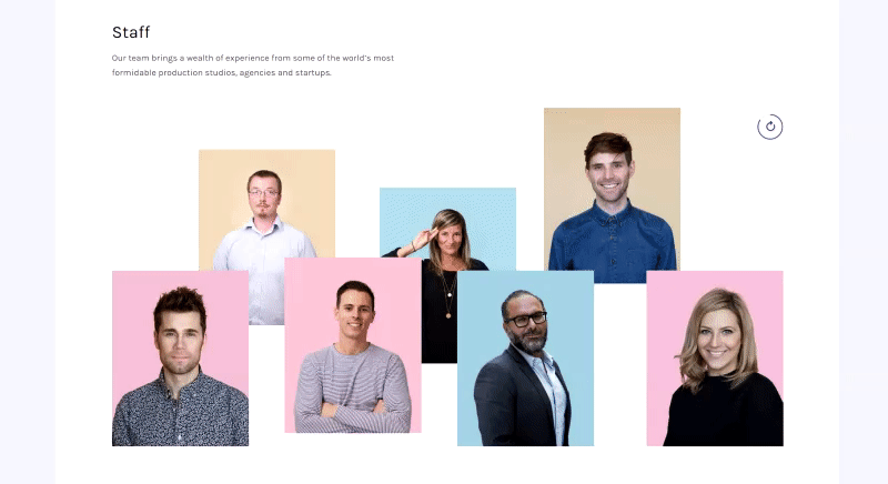
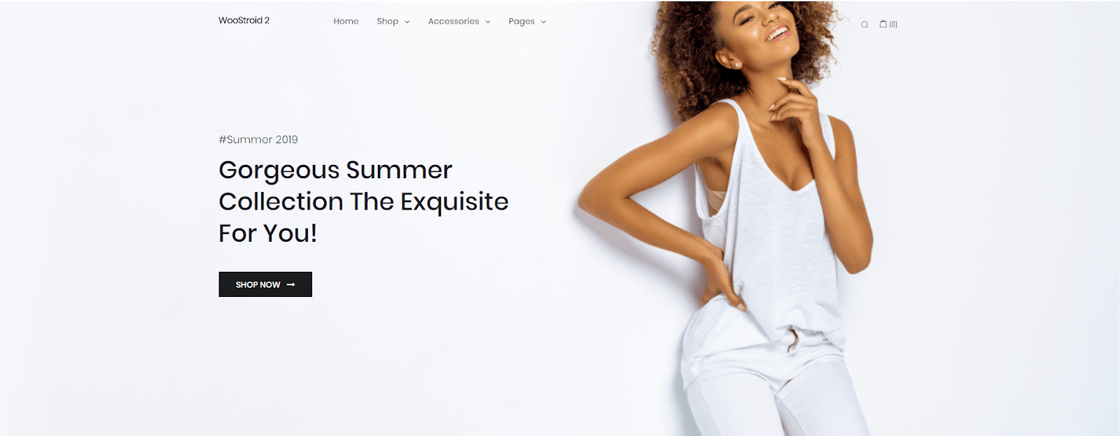
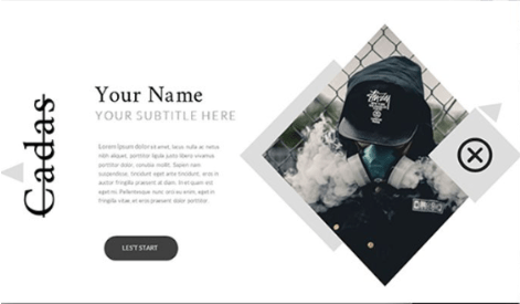
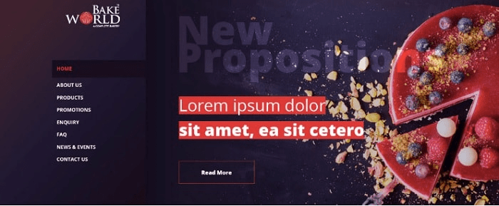
Everybody is fed up with an ordinary look of sites when everything is equally arranged both vertically and horizontally. Therefore, non-standard presentation of information and the use of oblique and distorted grid have become a trend. These make a site more unique and it is retained in client’s memory better. That is why designers have taken a fancy of this method and often use it in their work. Below, there are a few versions of sites with a non-standard grid. - Broken grid
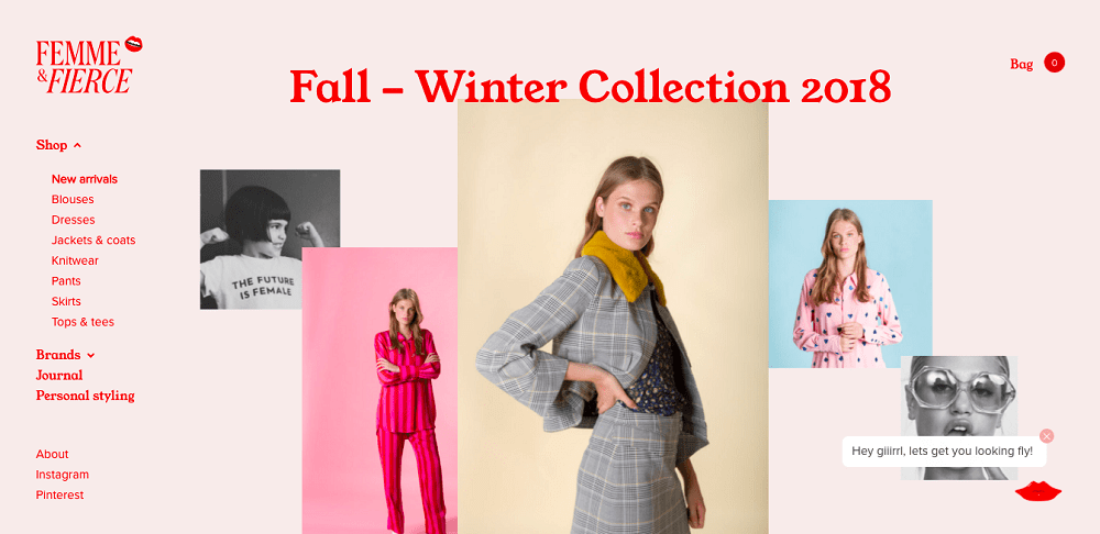
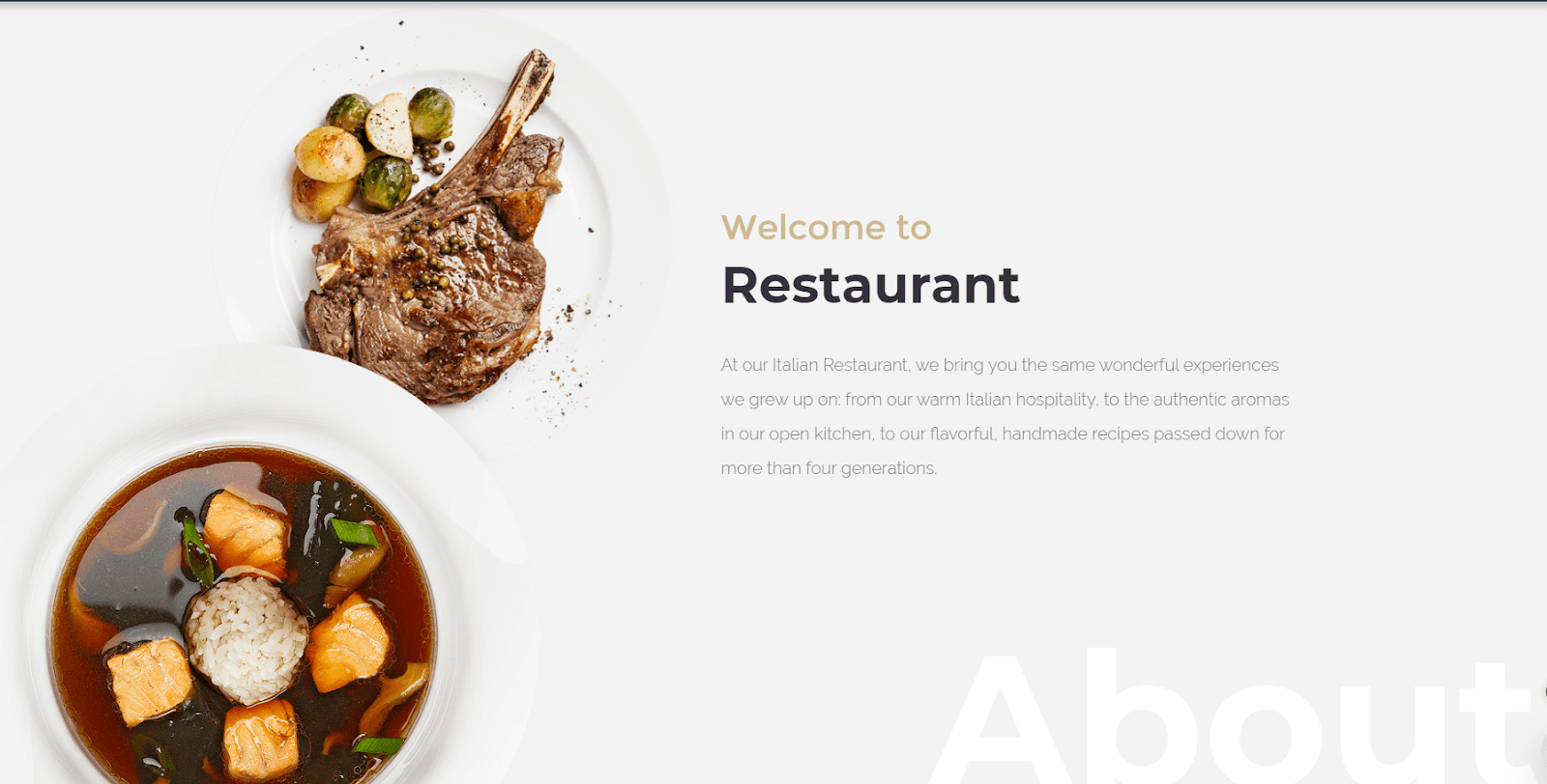
The following grid plays a remarkable role in modern design and it is on the peak stage in 2019. Designers and visitors of a website are delighted with the view of sites in a new way. Thanks to such an approach, the look of sites becomes more dynamic, which, in turn, allows to catch the attention of users and emphasizes conservatively oriented sections of a site. Below, there are a few examples of sites with a broken grid - There is more minimalism in trend
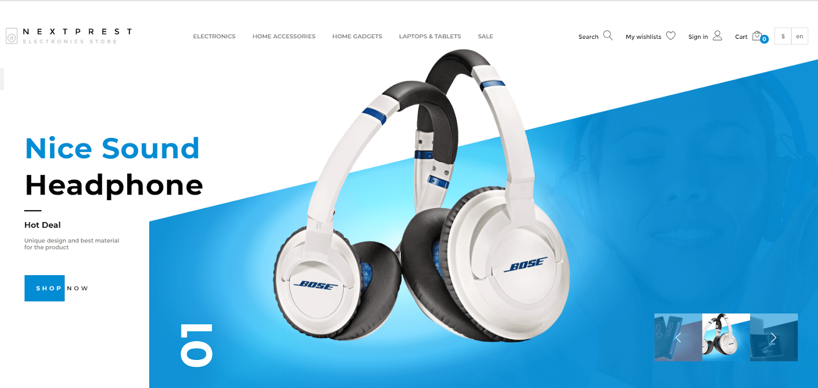
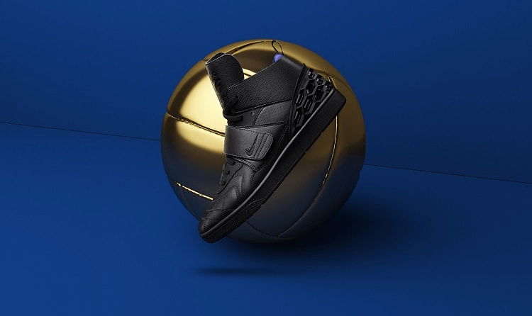
Minimalistic sites become more and more popular year by year. People are tired of cluttered sites, where you can immediately see all range of goods and excessive information. Therefore, first of all, it is necessary to write a minimal amount of text, but present it unusually and choose good typography. Designers often like using qualitative and bright photos, showing only one element instead of multielement photos and exactly this emphasizes the idea and concept of a company. This approach is good because a user pays attention to a necessary detail straight away and he or she is not distracted with excessive information. - Full-screen videos
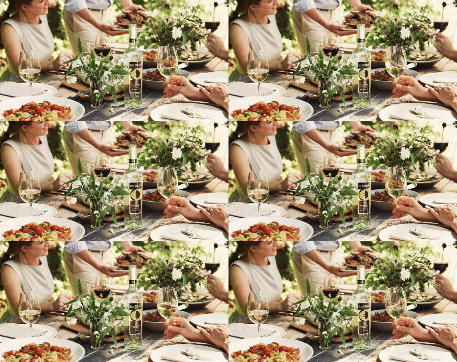
Whatever one may say, but a qualitative photo cannot present a company and its competitive benefits and services. However, a video can help with this. First of all, background video can emphasize the design of a website and present it more unusually and stylishly. Therefore, a site with a video better sticks in client’s memory and he or she will come back to it again and again and order your services or products. The examples of such websites: - Non-standard solutions of buttons
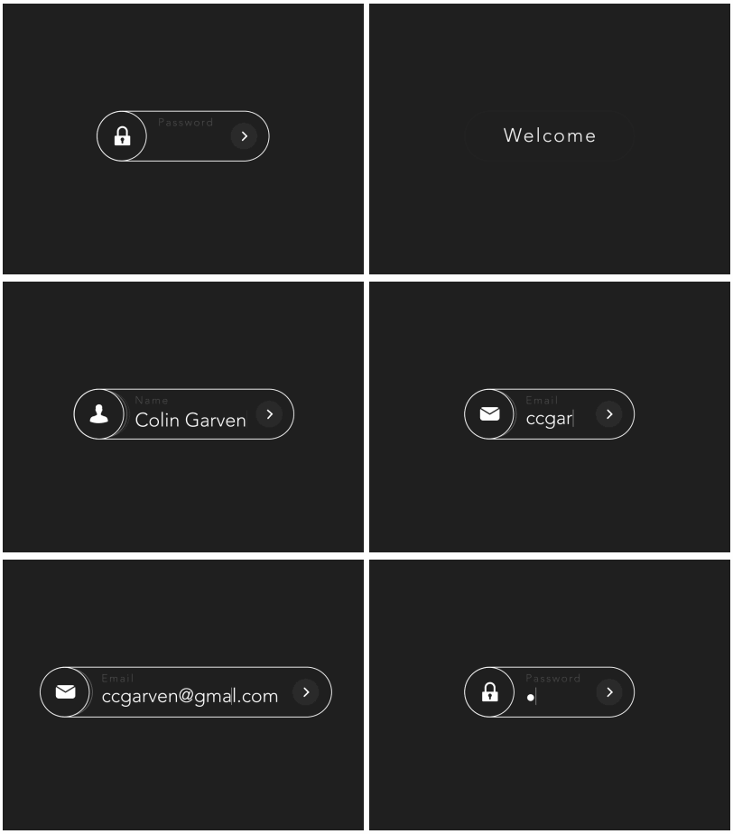
Buttons are one of the main tools of a site which interact with a client. In 2019 users have come to love unusual buttons and this is not strange. Everybody is fed up with looking at old buttons in the shape of rectangular with a text in the middle. Nowadays, they are becoming oval, triangular and other unusual geometrical figures. One more non-standard solution for a button is an animation and a floating design. Here are the examples of buttons which are in trend this - Geometry on a site
Geometry has been in trend since 2018. Firstly, geometrical figures, such as circle, square and triangular look minimalistically and as it has been mentioned above, minimalism is a trend in design. On the other hand, minimalistic elements do not overload a site, that is why the speed of work of such a site will be better and this is not a small advantage. - More free space
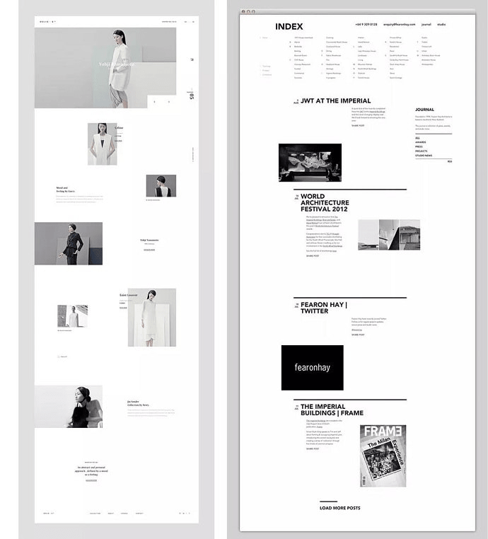
A website might sometimes “gasp” because of excessive information which is usually not interesting for a user. Therefore, the presence of free space on a site is the sign of professional design. At the very nonce when a website starts “breathing”, visitors will start to acquire information easily. Free space creates the “flow of design” and makes the interaction between a site and a user better. Remember that free space on a site always adds up elegance and refinement to it. The example of a website which “breathes” - Adaptive logotype
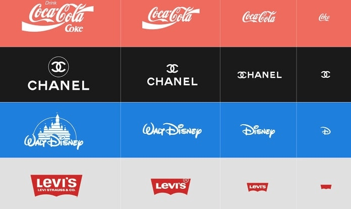
This is a relatively new trend in website design. Thanks to this trend, a lot of companies have started to adapt their logos to various display resolutions. Owing to this approach, companies save brand among its audience and improve the visibility of their sites when analyzing with search engines of a mobile version. Here how it is done by famous companies. - Bright graphic
In 2019 there is no place for ordinary and standard photos in modern web design. Visiting a site, a user wants to see something new, interesting and extraordinary. Designers have started to use and create qualitative graphic for this. Thanks to it, they make a cool emphasis on goods and services. There are cases when graphic is irrelevant for a certain theme of a site, in such case, it is necessary to choose a photo or video. But they must be juicy and qualitative too. Here how it looks img class=”aligncenter size-full wp-image-810″ src=”https://intltech.com/wp-content/uploads/2020/04/9.1.png” alt=”” width=”700″ height=”300″ /> - 3D element and animation
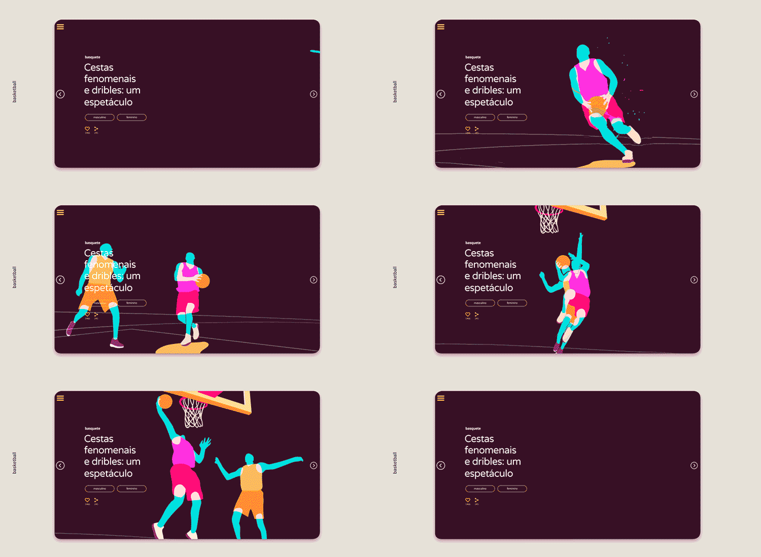
The last trend of this year, as you could guess, is 3D elements on sites and animation. Qualitative animation captures attention and lets a user know what a company offers and what the purpose of a site is without large descriptions. Nowadays, 3D technologies are used in everything, including websites. Since the tendency of augmented and virtual reality grows and improves year by year, 3D graphics will always be actual and popular on websites for many years. The examples of animation and 3D which can be used in web design:
Use technology and design to convert, sell, and scale online!
IntlTech unites the opportunities of design, development, and digital marketing for business promotion and building a strong brand.
When you choose IntlTech, you place bets on professionalism, individual approach, and creativity!
